The Most Important Button in a Code Editor
I’ve made many buttons in the course of developing Pickcode, our code editor for middle and high schools. In this post, we’ll discuss the most important button in the app, the run button.

The programming workflow
While programming in a code editor, the main workflow is:
- Identify your goal. Complete a tutorial, make a bar chart, create a game, etc.
- Write some code
- Test that code by running it
- Did it do what you wanted? If not, go back to step 2.
“Running code” makes your code editor take what you’ve written and give it to the programming language you’re working with for evaluation. In simpler terms, “it makes the computer do the thing”. For a language like Python, when you “run” the follwing code, you will see the numbers 10 and 18 appear on your screen.
print(5 + 5)
print(2 * 9)
If the goal of your program was to show the numbers 10 and 18 on your screen using basic arithmetic, nice! You’re all done. If your goal was to show the numbers 10 and 20, it’s back to the drawing board.
Designing for this workflow
Given the key workflow in question, it is important to optimize the user experience of an editor to facilitate the easy writing and running of code. It is also important to consider the intended audience.
For professional developers, there are quite a few other aspects to the software engineering workflow, including source control, debugging, linting, or running custom commands via a full terminal. For novices, I would argue that 99% of time is spent on viewing tutorial instructions, writing code, and running it. Probably with the mouse. (More on that later). So, button placement is mission critical.
Here’s a screenshot of our Python editor
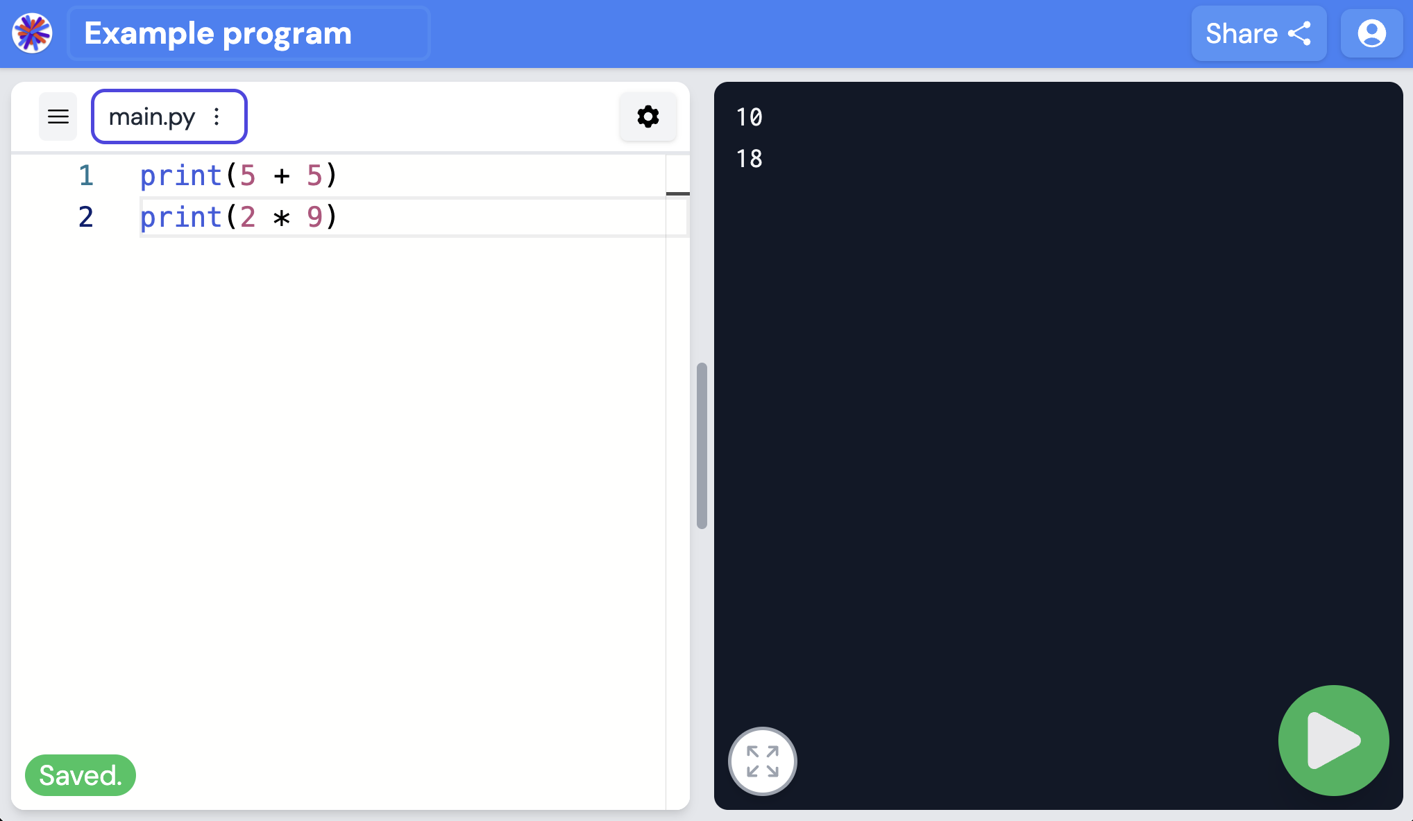
The size and placement of our run button are guided by Fitts's law. From Wikipedia:
The law predicts that the time required to rapidly move to a target area is a function of the ratio between the distance to the target and the width of the target... Placing layout elements on the four edges of the screen allows for infinitely large targets in one dimension and therefore presents ideal scenarios.
Next, here’s a screenshot of running the same program in VS Code, a very popular editor for professionals. Can you find the run button?
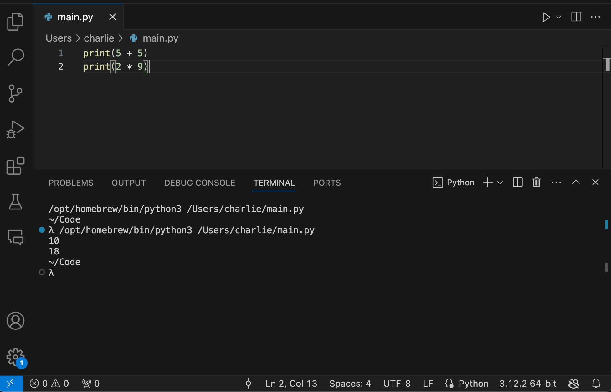
There’s more going on in the VS Code window. That’s because VS Code is for professionals, who need powerful tools to get their job done.
(Quick aside on keyboard shortcuts: I doubt anyone clicks half the buttons in VS Code. They use the keyboard. Keyboard shortcuts are awesome and are probably the single most efficient way to get through the code editing workflow. For absolute novices, I think it’s inappropriate cognitive overload. IDLE is a Python editor whose “Run button” is either hidden in a dropdown menu or accessed by pressing F5. I have watched novices struggle with this. It’s tough.)
Why does this matter
I would argue that the design of a code editor has a pretty large effect on a beginner’s ability to gain expertise in programming. The Youtube channel Veritasium lists the following as a few key aspects of gaining mastery in a new field:
- Valid environment - Do your actions deterministically affect your achievement of your goals? You can’t gain expertise in playing roulette.
- Many repetitions - Can you repeatedly practice the skill in question?
- Timely feedback - How fast do you learn whether your last repetition was correct or incorrect?
The design of the code editor a student uses is important for all three of these aspects of gaining mastery.
- Valid environment: Code is deterministic. However, if an editor is confusing enough to the learner, it may appear as though it behaves randomly. (See: “Code Doesn’t Happen to You”)
- Many repetitions: If it’s easy and obvious how to run code, a student will do it more often.
- Timely feedback: Does code execute without delay, showing errors and output clearly?
To put a finer point on this, the code editor is the environment in which a student learns, and it facilitates their gaining of mastery, so it’s important.
We also have the numbers on this. In the past 2 years, students have clicked the play button on Pickcode 2.5 million times. If the run button was smaller, or in the wrong place, or a worse shade of green, I think that number would be a lot lower. In fact, the number of times the run button is pressed is the primary user metric we follow at Pickcode. Almost all of our decisions in the product revolve around creating an environment and experiences where students click the run button more often.
Recommendations
The choice of code editor for professionals is a bit of a flame war topic that I will 100% not get into. Personally, I use VS Code.
For middle or high school students, the code editor I recommend is Pickcode. This is the Pickcode blog, after all. If you’re not convinced, the appendix of this post will include anonymous screenshots of a number of other popular code editors for novices. Which button would you prefer to click on? And, if you’d like a chance to press our run button, feel free to create a free account and write some code.
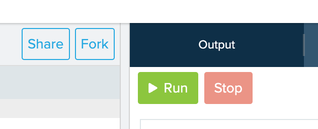
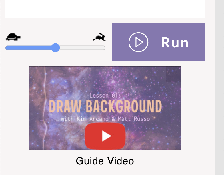
Appendix: Other Run buttons and the area surrounding them






The end. Here's a picture of my dog.
